
Among the many challenges book cover designers face is trying to represent a book’s premise or main character without getting so specific that readers are left with little to imagine. A few years ago, the headless woman was one of the most commonplace sights on bookstore shelves (if the lack of something can be considered a “sight”). By not showing the female character’s face, a publisher assumes that readers will be able to use their imaginations to fill in what she looks like.

But lately, another cover design trend has been popping up on this summer’s crop of beach reads: the flat woman. Inspired by the “flat design” that’s become standard on the Web, these covers take on a minimalist style characterized by bright colors, simple layouts, and lots of white space. Several different designers and publishers have used this approach on hardcovers and paperbacks alike, especially those aiming for the upmarket-but-still-commercial-fiction-for-ladies sweet spot. (The headless woman is also still going strong.)
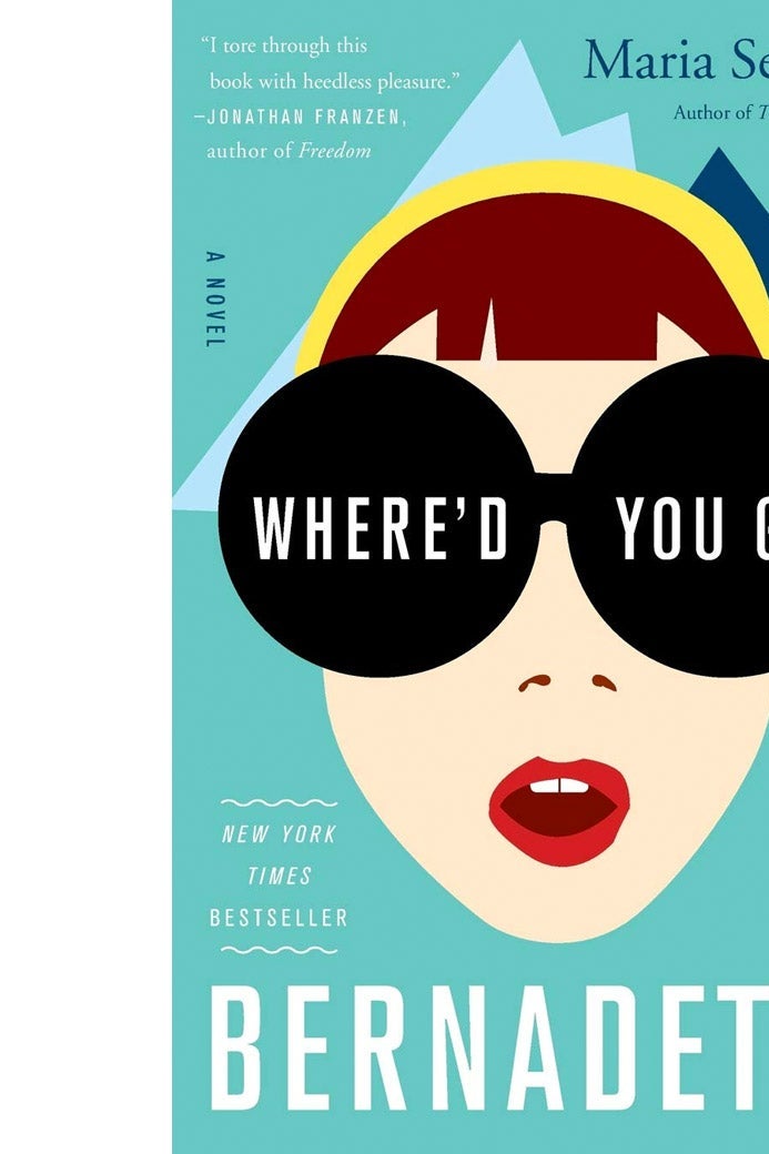
The patient zero of flat women might be Bernadette, the heroine and cover star of Where’d You Go, Bernadette, by Maria Semple, from 2012. On that cover, a woman’s face floats over a turquoise backdrop. Her only facial features are two squiggles that represent nostrils and a two-tone mouth, plus some blunt, angular bangs. Bernadette’s eyes are covered by sunglasses or binoculars, and judging by the other ocular obstructions on many of these covers, flat design tends to avoid depicting eyes.
The fancy and pleasingly flat lady on the paperback cover of Kevin Kwan’s comic novel Crazy Rich Asians followed suit. She is silhouetted on a pretty salmon backdrop, and her flat hair, skin, features, and jewelry make the image pop; it’s cartoonish but not in an overly girly way. (Hear that, male readers?) Or consider the hardcover version of the The Royal We by Heather Cocks and Jessica Morgan: In the same way the story is supposed to invoke the love story of England’s Prince William and Kate Middleton without actually being about them—it’s about a fictional royal couple inspired by the real-life royals—the cover plays on our memories of Will and Kate’s wedding but flattens the image into pretty shapes with plausible deniability, leaving something to the imagination.

Keith Hayes, who designed the Bernadette cover for publisher Little, Brown, told me via email that he didn’t have any intention of using the flat design style or starting a trend when he conceptualized this cover; he was just working “out of the inability to actually draw,” he said.
“Finding an appropriate enough photograph and placing some type on it just didn’t seem special enough,” he said. “It needed a lighthearted cover that would appeal to both women and men and also feel original.” Hayes says he wanted to do an illustrative approach but didn’t have specialty training in that area. “I like to try to solve my design problems on my own. I thought I could do this in a somewhat simplistic way using basic shapes,” he says.

Bernadette became a best-seller and is being made into a movie. Hayes speculates that the book’s hit status may be partly responsible for all the flat covers popping up these days. “It is not uncommon for publishers to try and ride the coat tails of the last great success,” he said. And hardcover versions of this year’s I Take You by Eliza Kennedy; A Window Opens by Elisabeth Egan; and Kwan’s newest novel, China Rich Girlfriend, seem to be following in the flat tradition: bright colors, cool shapes, vague features.
Economists and policy wonks say the world is getting flatter. It looks like that line of thinking also applies to book covers.